 User Help Manual
  Learn FAQ
  Send us feedback
 ")


- This holiday season embraces new beginnings with the latest update of VSDC Video...
- Change is all about improvement, and this process wouldn't be possible without y...
- Intro In 2024 the options range for creating visual effects is incredibly dive...
- Are you ready to explore new heights with the latest major VSDC update? Finally,...
Animated charts in VSDC Free Video Editor: a beginner’s guide
The most difficult part of any presentation is to maintain the attention of the audience, especially when there are numbers involved. Data visualization typically works well, however still pictures and diagrams won’t impress anybody these days. That’s why infographics have become so popular, and therefore – animated charts as well.
Animated charts used in a presentation can help you illustrate business growth, analyze market trends, and visualize development predictions. In the instructions below, we’ll show you how to create dynamic animated charts in a free video editing software called VSDC.
Download the latest version of VSDC here.
How to start working with charts in VSDC
Once you’ve installed and launched the program, open the “Editor” tab and click the “Add object” button located in the menu at the top of the interface. Select “Chart” from the dropdown menu to add a chart to the scene. You can also use the dedicated icon ![]() in the menu on the left-hand side or the Ctrl + C combination. In the pop-up window you’ll be asked to confirm the object’s position on the timeline – just click Ok. A generic chart template will be placed in the scene once you perform this action.
in the menu on the left-hand side or the Ctrl + C combination. In the pop-up window you’ll be asked to confirm the object’s position on the timeline – just click Ok. A generic chart template will be placed in the scene once you perform this action.
Note that the “Add chart” icon on the left provides 3 options: adding a chart, a diagram, or a “Series” layer. These are the layers that help you fine-tune a chart on different layers. Each new layer is opened with a double-click on the previous one. Thus, by clicking on the “Chart” layer twice, you move to the “Diagram” layer and so on. One chart can contain several 2D diagrams.
Chart setup layers in VSDC
Let’s review each setup layer for you to have a better understanding of where to resort for a necessary parameter.
Chart
This is the first layer you start working with and it allows for setting the general appearance of the chart. Here are the parameters available here:
- The time of chart appearance in the scene and its duration time;
- Colors of axes, borders, and background;
- Axes and borders titles;
- Data direction and alignment.
Diagram
When you make a double click on the “Chart” layer, you get to the second level of settings, called “Diagram”.
The settings on the “Diagram” level are similar to the settings on the “Chart” level. The main difference is that here you’ll be able to edit each diagram individually when there are multiple diagrams in a chart. Here are the properties you can work with:
- Diagram style (2D diagram, 3D pie, funnel, pyramid, etc.)
- The time of the appearance in the scene and the duration time for each diagram;
- Diagram title;
- Colors of each diagram axes and background;
- Format of axes and borders titles.
Series
The last layer you get to by clicking on the Diagram level twice is called “Series”. It allows for adjusting the data displayed in the chart. Here is what you can set up in particular:
- The moment of data appearance and its duration time in the scene;
- Chart legend, its format, color theme and location;
- Series properties style (for instance, if you’ve chosen a 3D diagram style earlier, you’ll need to choose a corresponding properties style such as Pie 3D, Torus 3D, etc.);
- Format, color, and location of the chart data;
- Labels shape, colors, and size;
- The appearance dynamics of the data, etc.
How to create and design a chart in VSDC: basic principles
Now, let’s go over creating a 2D chart in VSDC in details. Follow the steps below.
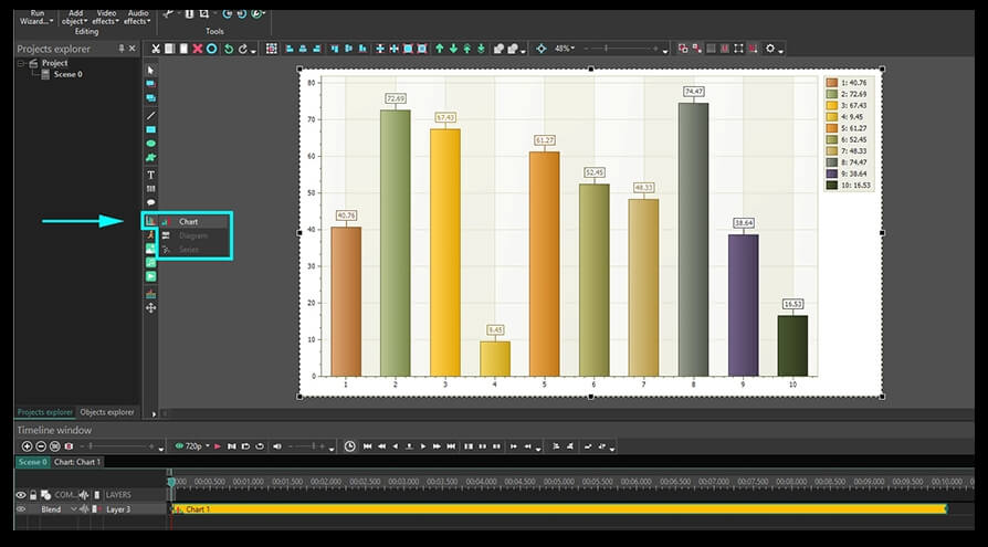
Step 1. We’ve already touched upon the first step of creating a chart. You need to open the “Editor” tab and click the “Add object” button. From the dropdown menu, select “Chart” to get a generic chart template with several bars as illustrated below.
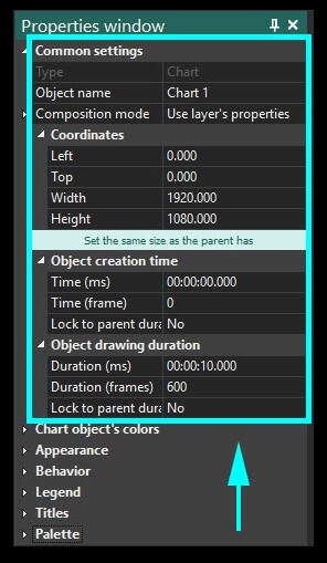
Step 2. Using the right mouse button, click on the “Chart” layer and select “Properties” from the menu – the “Properties window” will slide in from the right-hand side.
The first menu section here is called “Common settings”. This is where you can type a name for the chart layer, its precise location in the scene, the time of appearance and duration. Note that you can set up the appearance moment and the duration using frames or milliseconds.
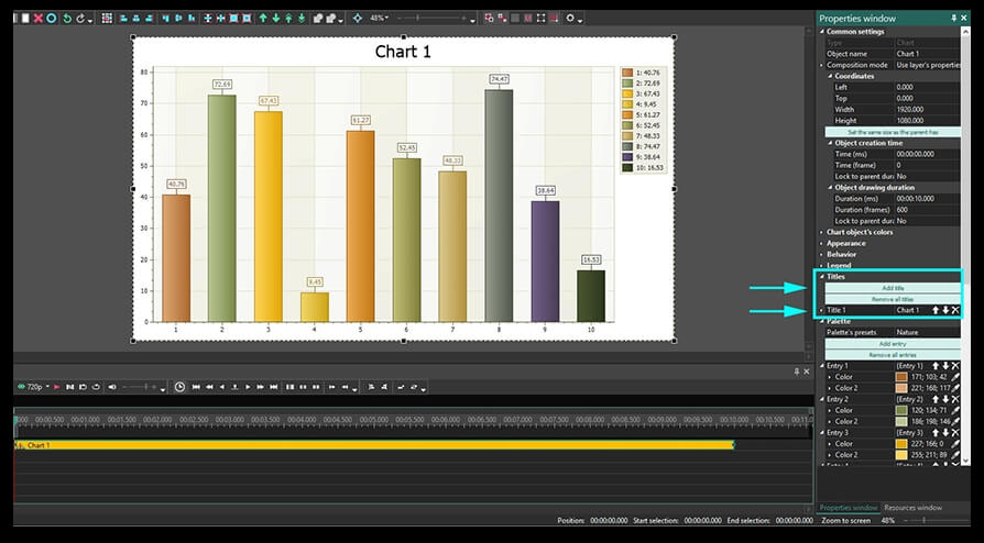
Step 3. To add a title right to the chart object, scroll down to the “Titles” section and type the desired name in the field called “Title 1”.
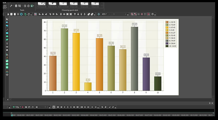
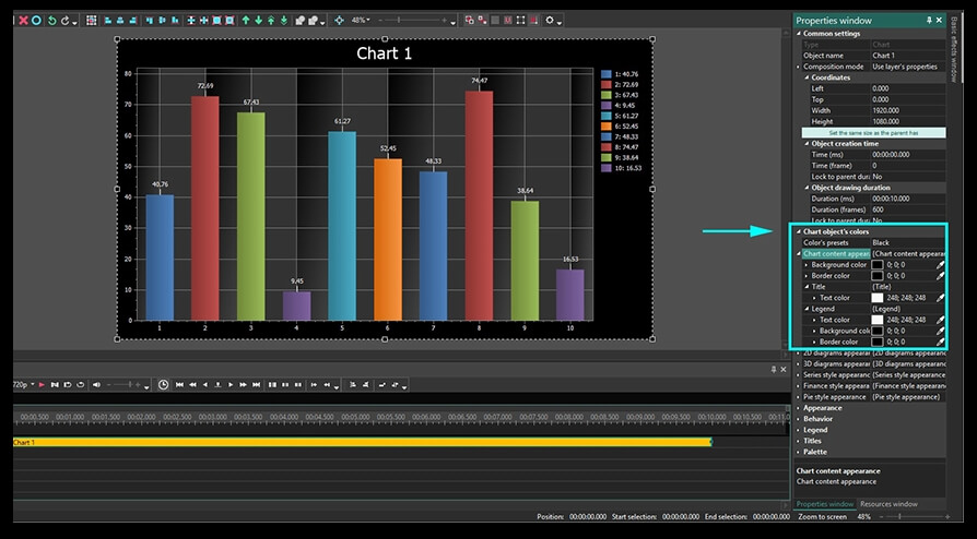
Step 4. To edit colors of the chart, go to the section called “Chart object’s colors” and either select colors manually or apply one of the presets. For example, in the illustration below, we’ve chosen the black preset to apply the black-and-white style to the background, the legend, the data, and the borders.
Step 5. To change the color theme of the gridline area, open the section called “2D diagrams appearance” located in the same “Chart object’s colors” menu. For example, in the illustration below we’ve adjusted the following parameters:
- Background – black and gray (comes in the selected color preset).
- Axis color – light blue.
- Interlaced color and Interlaced color 2 - black.
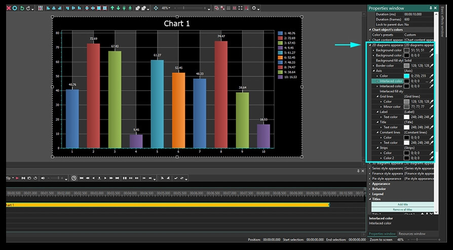
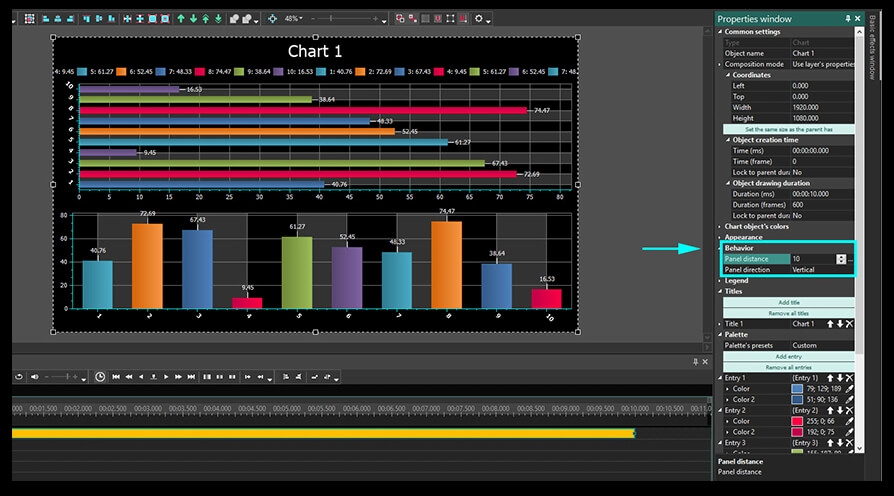
If you have added multiple diagrams to the chart, you can set up the distance between them as well as their style and position regarding each other – horizontal or vertical, rotated or not.
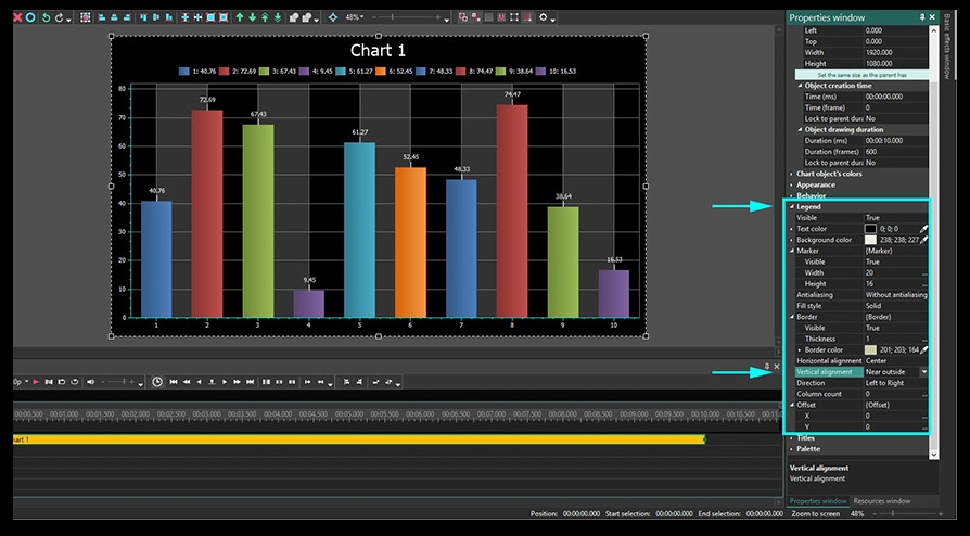
Step 6. Finally, you can set up colors of the chart’s legend: its background, text, frame, labels as well as the legend’s position. In the example below, we’ve left the color theme selected with the preset, however, we’ve changed the legend’s position. Check the following parameters:
- Horizontal alignment – center
- Vertical alignment – near outside
- Direction – left to right
- Column count - 0
Step 7. The next step will be filling bars with color. If you want to have the Gradient effect, you need to select 2 colors for each bar. In the menu on the right-hand side, bars are indicated as “Entry 1”, “Entry 2”, etc. For example, in the illustration below, we’ve filled each bar with a gradient of the same tone colors.
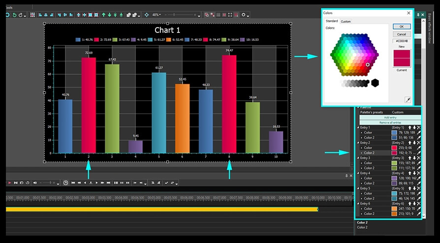
The arrows “up” and “down” in each entry field allow you to apply the selected color to the previous or the next bar. The X icon removes all the changes made to the entry.
All the parameters selected in the “Properties window” for the “Chart” layer are applied to the entire chart. If you want to modify the appearance of each diagram in the chart, make a double-click on the “Chart” layer and select the diagram you want to work with.
How to design the appearance of a selected diagram
In case you have multiple diagrams in a single chart, here is how you can edit each one independently.
Make a double click on the “Chart” layer to get to the “Diagram” layer. On the timeline, you’ll see each diagram as a separate layer. If you want to add a diagram, you can do it manually by clicking the “Add chart” icon and choosing “Diagram” option this time.
Make a right mouse button click on the diagram you want to edit and choose “Properties” – the “Properties window” will slide in from the right-hand side.
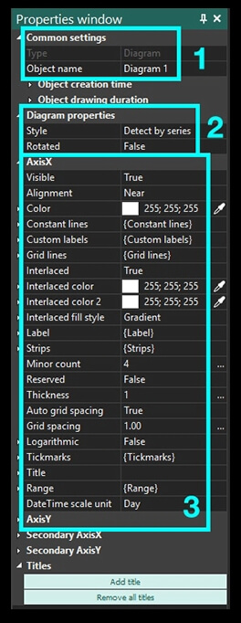
- The “Common settings” menu is similar to the one for the “Chart” layer.
- The “Diagram properties” menu allows to choose the diagram style (2D diagram, 3D pie, funnel, etc.) and the direction of the bars – horizontal or vertical.
- The axis X and Y settings allow for choosing colors, thickness, and other parameters for each axis. Secondary axis X and Y are exactly the same as the primary ones and located on the opposite sides of the chart.
Finally, you can change the axis titles here. Specifically, you can edit their font, format, angle, and other parameters as illustrated below.
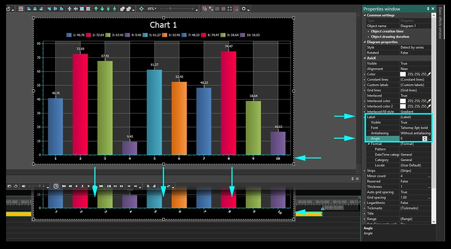
If you want to go into the details, you can also adjust the thickness of tick marks, change their number, length, and everything in between to make your chart unique and impeccable.
Range
The reason why “Range” is described in a separate paragraph is that it is directly related to chart animation settings.
First of all, you should find the field “Axis X – Range – Auto range/View auto range” and switch both settings to “False”. Do the same for Axis Y. The “Auto range” allows for setting the minimum and maximum axis values. Meanwhile, the “View auto range” parameter allows for setting the minimum and maximum axis values that will be visible during the chart playback. You should always make sure that the former has higher values than the latter.
How to set up range parameters
To illustrate everything we’ve just said above, let’s select the following settings in the Range menu for our example chart:
1. Auto range field:
Minimum value:
- Initial value – 0. This is the minimum possible axis scale value for the first frame.
- Final value – 0. This is the minimum possible axis scale value for the last frame.
Range size:
- Initial value – 100. This is the maximum possible axis scale value for the first frame.
- Final value – 100. This is the maximum possible axis scale value for the last frame.
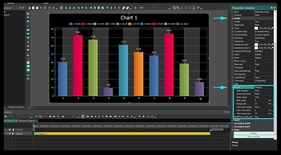
2. View auto range field (these parameters define the displayed axis scale limits)
View minimal value:
- Initial value – 0. This is the minimum displayed value for the first frame.
- Final value – 10. This is the minimum displayed value for the last frame.
View range size:
- Initial value – 20. This is the maximum displayed value for the first frame.
- Final value – 70. This is the maximum displayed value for the last frame.
You can see how your video presentation changes as you input various values by using the “Preview” button on the left-hand side above the timeline.
First frame Last frame
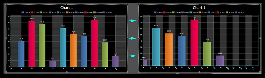
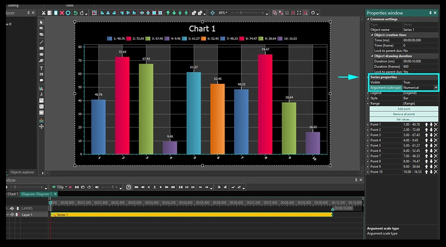
If in the process you’re facing format issues (for instance, when your scale starts with 1 instead of 0), go to the “Series” layer and select the “Numerical” Argument scale type in the Series properties menu.
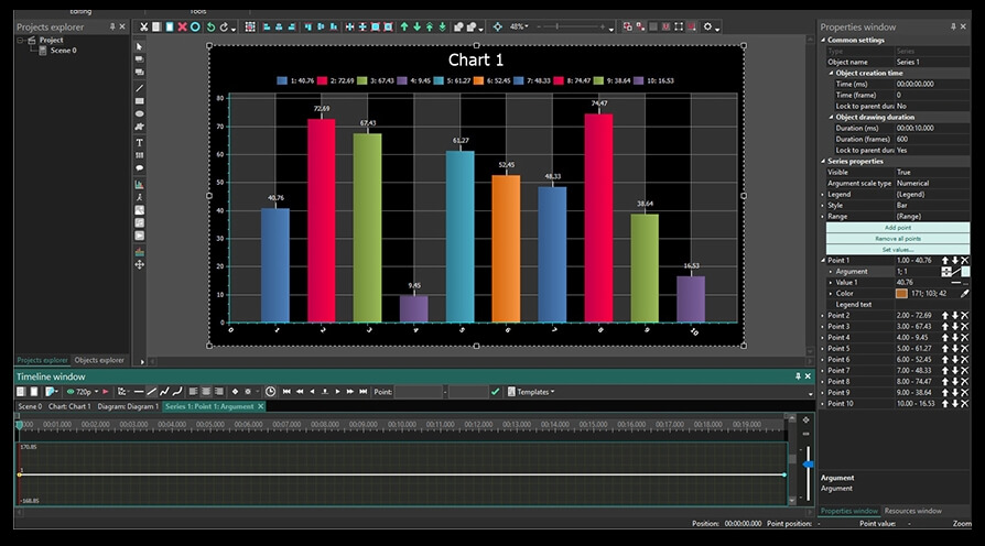
How to work with the “Series” layer
The final layer is called “Series” and it includes parameters related to the data displayed in the animated chart. Make a double-click on the “Diagram” layer to open the “Series” layer, then use the right mouse button to open the “Properties window”.
The “Common settings” menu is similar to what you’ve seen on the “Chart” and “Diagram” layer. That’s why let’s go straight to the “Series properties” menu.
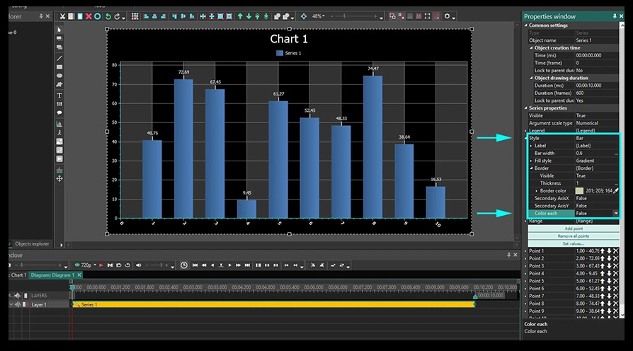
Legend. Here you can change the title of the legend. Keep in mind that it will only be visible if all the data on this layer (bars in our case) have the same color. To achieve that, you need to select “False” in the following field: “Style – Border – Color each”. Here is what it will look like:
Range. Now, let’s switch to the Range menu settings. Just like you’ve seen on the “Diagram” layer, there are minimum value and range size fields.
Similarly, the minimum value includes two parameters:
- Initial value. Here, you need to put the number of bars that will not be displayed during the first frame. In other words, if you type “2” as the initial value here, the first two bars will be skipped, and the playback will start from the 3rd one.
- Final value. Here, you need to specify how many bars will not be displayed during the final frame. So, if you type “5”, that will mean bars #1-5 will not be visible in the last frame.
Note that the color from the bar that gets excluded from the playback is applied to the following bar displayed during the playback. To be more precise, if the first bar is yellow and the second bar is blue, but the first one will not be displayed during the first frame, the second bar becomes yellow automatically during the playback.
Range size also has two key parameters:
- Initial value. Here, you decide how many bars in total will be displayed in the first frame. For example, if you put “2”, there will be only 2 bars displayed in the video starting the first one (indicated in the Minimum value field).
- Final value. Here, you decide how many bars will be displayed in the last frame. For example, if you put “10” – there will be 10 bars visible in the last frame (starting from the first one displayed.
How to set up properties for a particular bar in the diagram
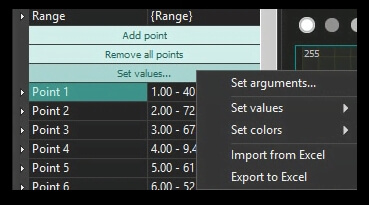
You can edit each bar in the diagram using the “Series” layer. Bars are indicated as “Point 1”, “Point 2”, etc. So, for each point, you can set up initial and final parameters – value, titles, and colors that will be displayed at the beginning of a video and at the end.
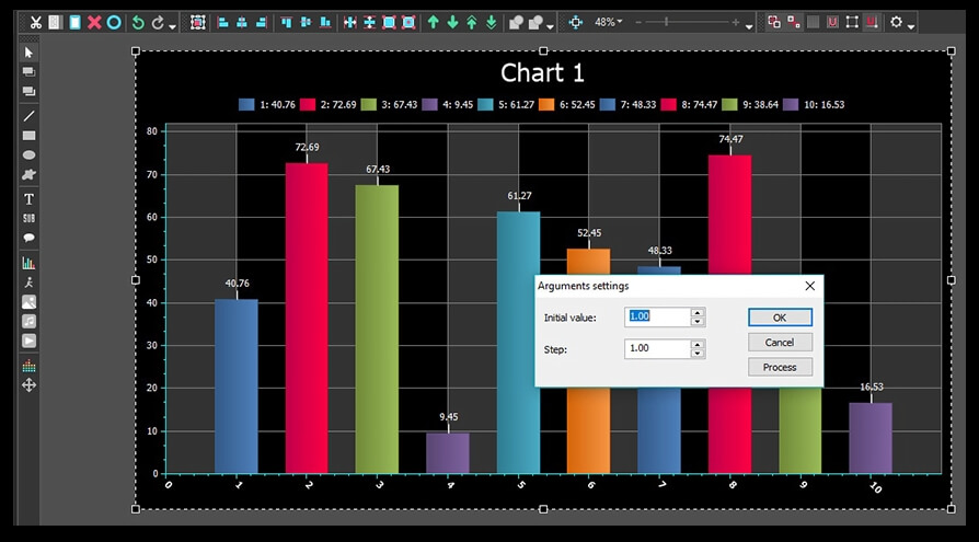
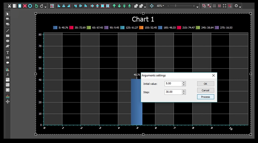
To do it, use the “Set values” button and select “Set arguments” from the pop-up menu. Once you do that, proceed with typing the initial value and the step.
- Initial value. This parameter defines the value on the Axis X for the first bar in the diagram. By default, it’s always 1 – see the illustration above.
- Step. Here, you set up an interval between bars. By default, it’s always 5.
After you set the values, click «Process» and then «Ок».
The second menu option once you click the “Set values” button is called “Set random values”. It creates random Axis Y values for all the bars. The more times you click on this option, the more random values will be applied.
Similarly, the following “Set colors” option allows for setting random colors for the bars or using a palette.
How to work with charts from Excel files
In addition to everything above said, you can build charts based on the data from an Excel spreadsheet uploaded to VSDC. To activate this feature, go to “Series – Set values – Import from Excel”. For correct upload, you need to format the data the following way:
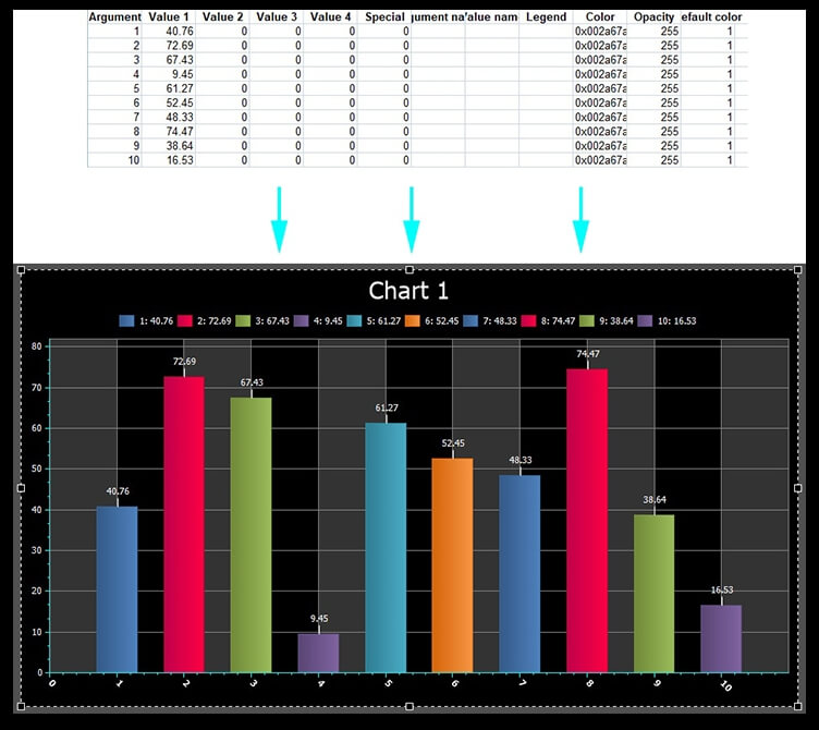
In the illustration above, the “Argument” column contains Axis X values for each bar, and the “Value 1” column contains values for Axis Y. If you need to export chart data to an Excel file, proceed to “Series – Set values – Export to Excel”.
How to set up chart dynamics
We’ve finally approached the most exciting and the shortest part of our instruction – applying dynamics to a chart. The point of a dynamic chart is that its elements (bars, for instance) change their values on both Axis as the video continues.
To apply dynamics to a chart, you need to open the following setting on the “Series” layer: “Series properties – Points”. Then, select the point you’re planning to apply dynamics to and find the “Argument” or the “Value” field. Click on the three-dot <…> icon and you’ll see a straight trajectory in the timeline.
This trajectory corresponds with the value of the chosen bar on the Axis X or on the Axis Y – depending on whether you chose the “Argument” or the “Value” field. By making double clicks on it, you can create control points and drag them around modifying the trajectory. By dragging control points up and down you apply positive or negative values for a particular chart bar in a chosen time moment.
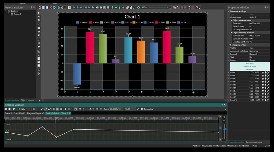
Below is an illustration of dynamics applied to the Point 1.
Now go ahead and try to design your first animated chart in VSDC!
Looking for more awesome tutorials? Check out our YouTube channel and ask any question on our Facebook page.
You can get more information about the program on Free Video Editor' description page.
© 2011-2025, www.videosoftdev.com, FLASH-INTEGRO LLC. Privacy policy | Terms of use | About us
All trademarks referenced herein are the sole property of their respective owners.
Copying any materials from this site allowed only with written consent of Site Administration.